Neutral
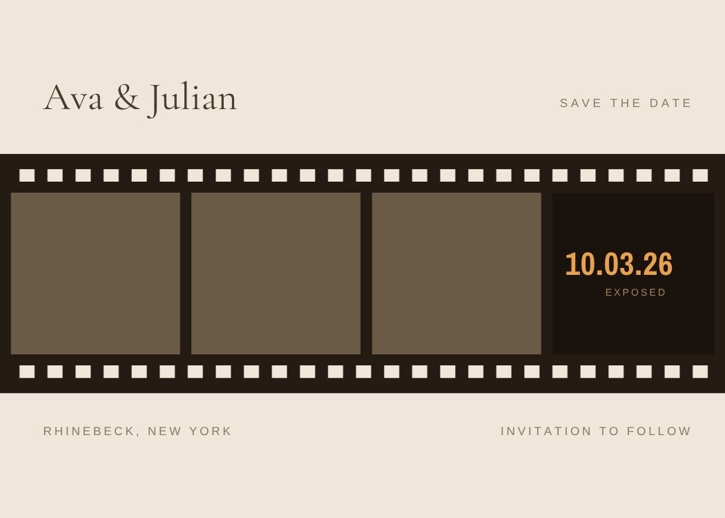
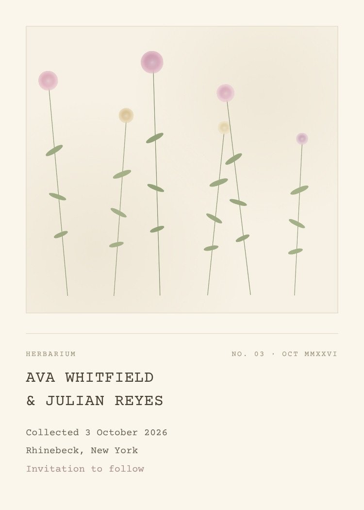
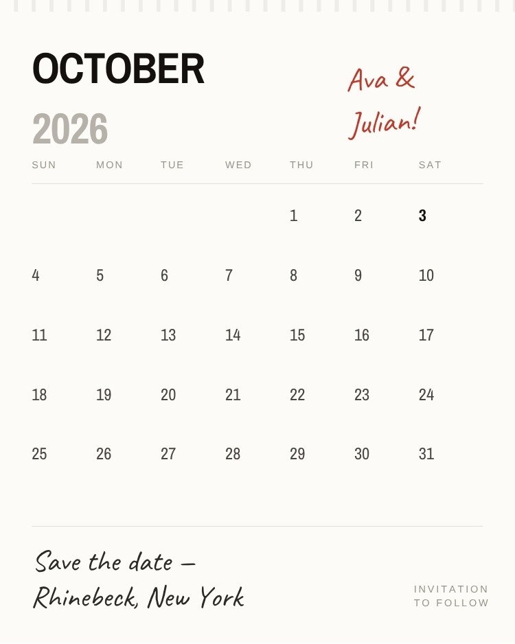
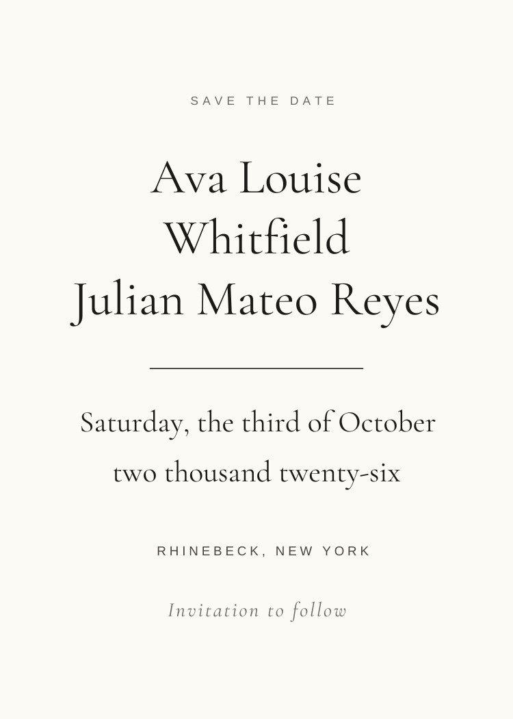
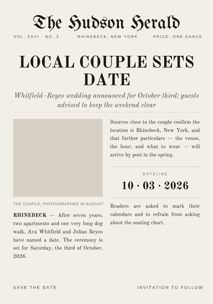
Cream, ivory, bone and taupe — the palette that matches everything later.
29 templatesBrowse →
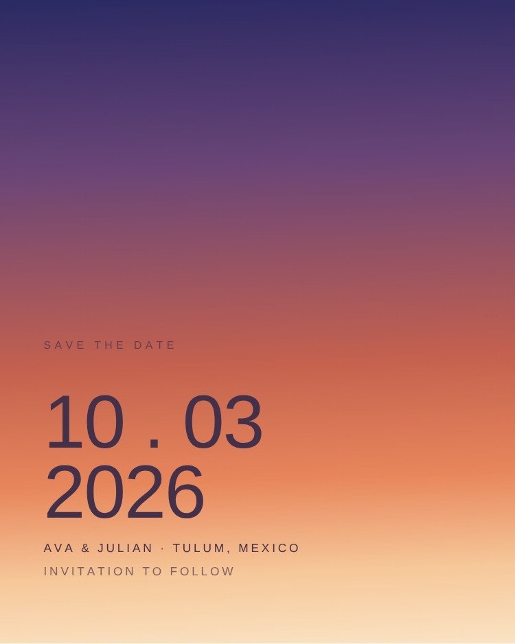
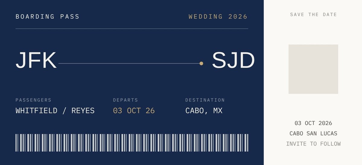
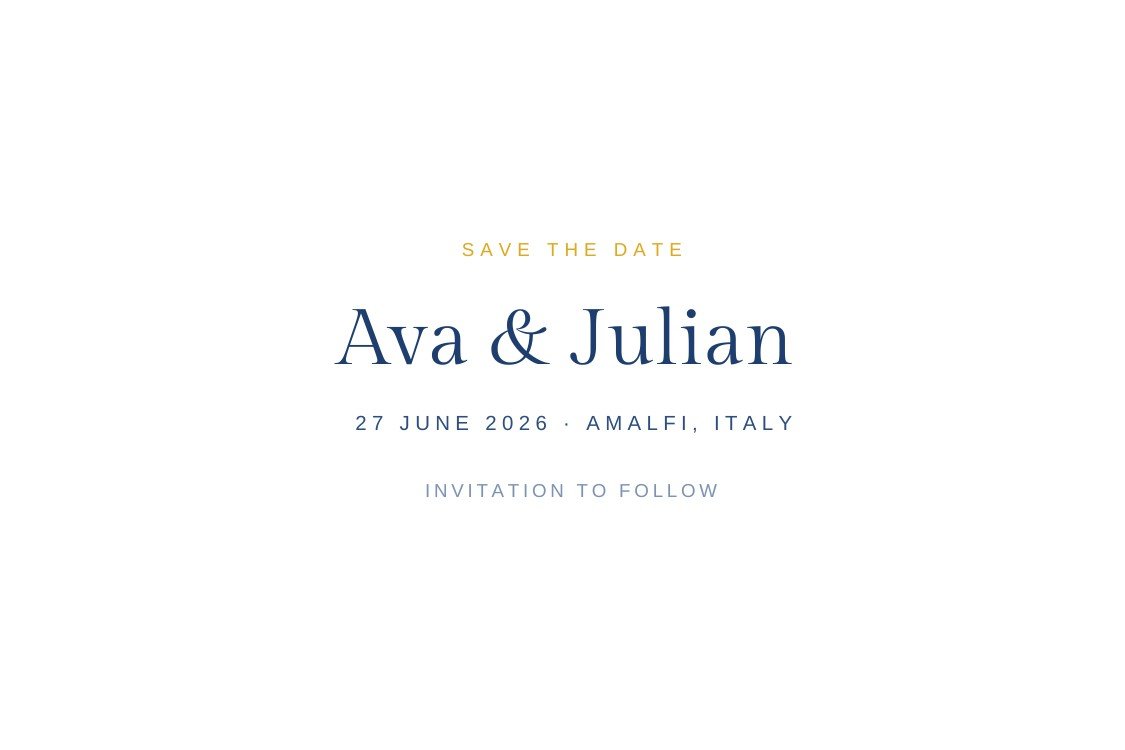
Palette-led browsing, with real save the dates behind each swatch so you can see the range inside a color.
Cream, ivory, bone and taupe — the palette that matches everything later.
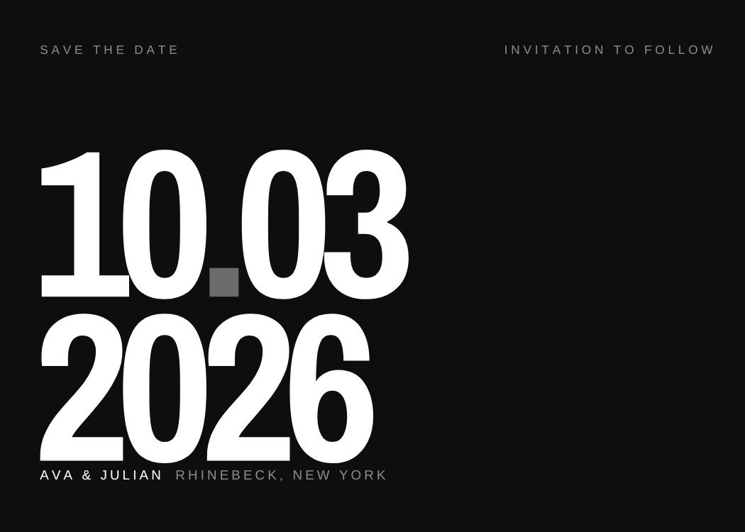
Maximum contrast, which is what a thumbnail in a text thread needs.
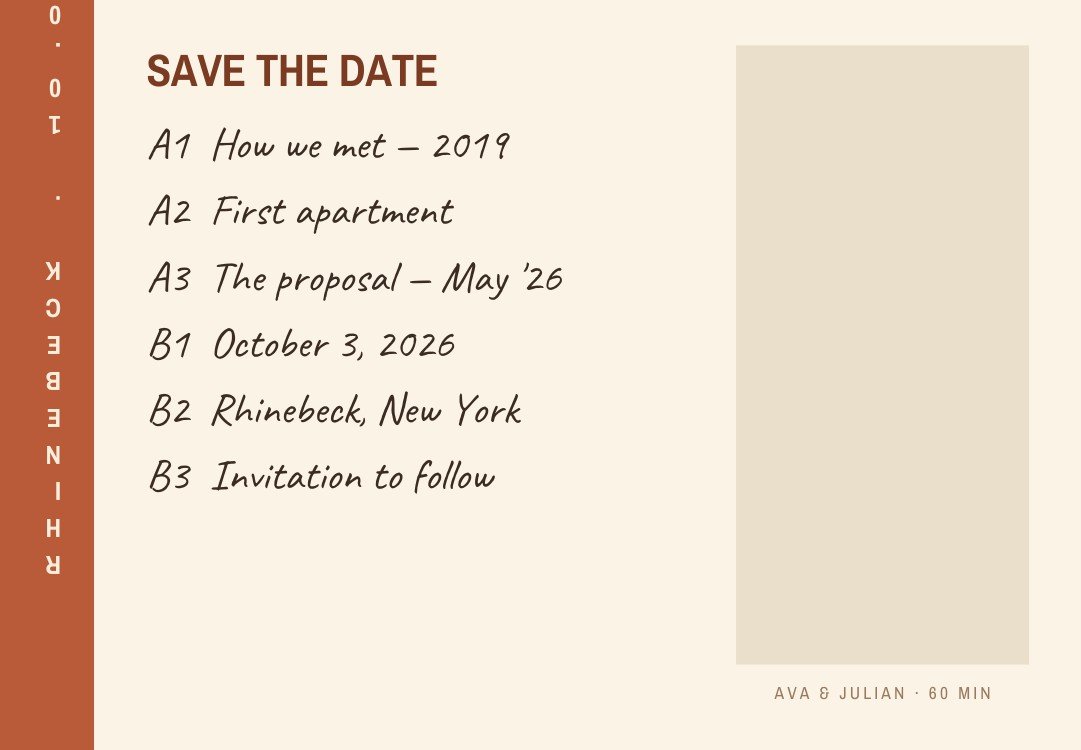
Warm clay and rust — the desert and autumn palette.
Keylines, seals and script — used as an accent, not a fill.
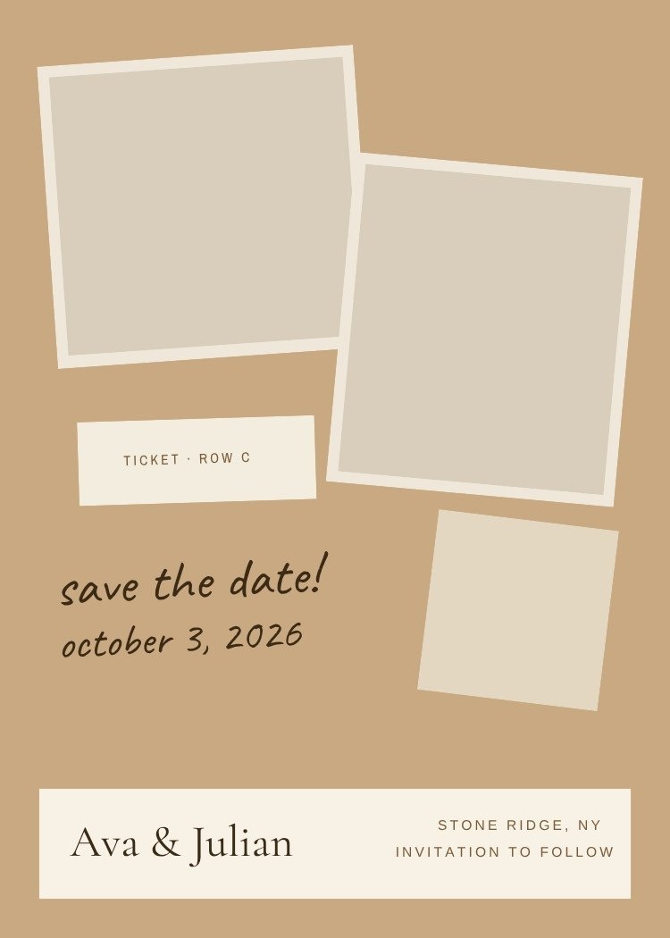
Kraft, leather and sepia — the rustic and travel palette.
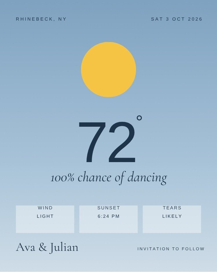
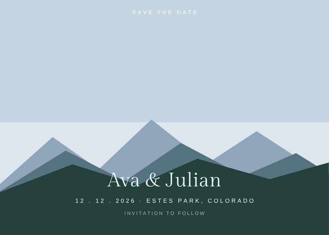
Muted, slightly grey blue — soft without being pastel.
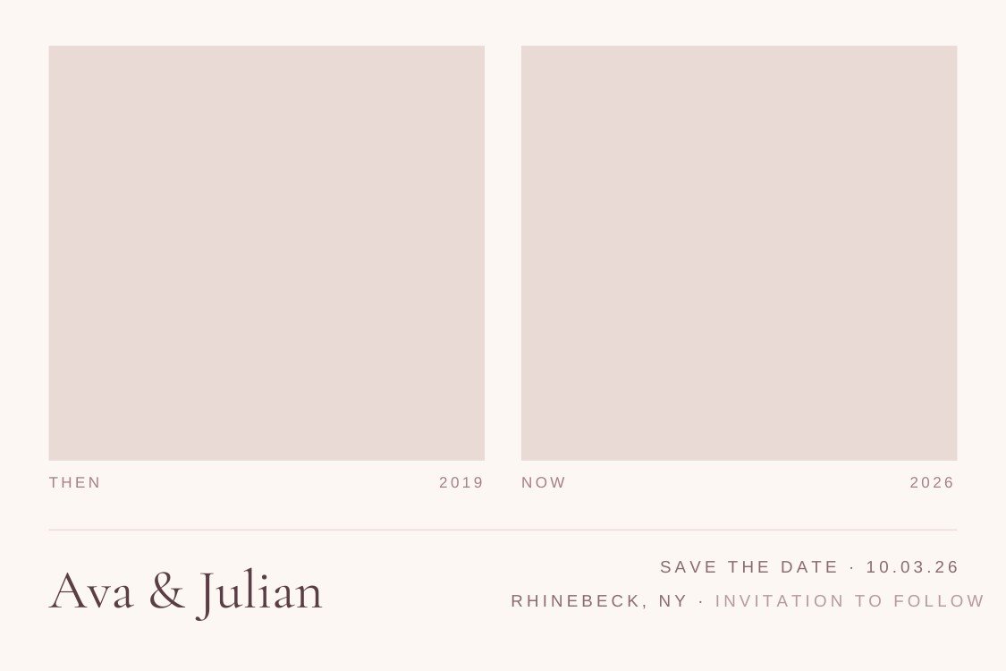
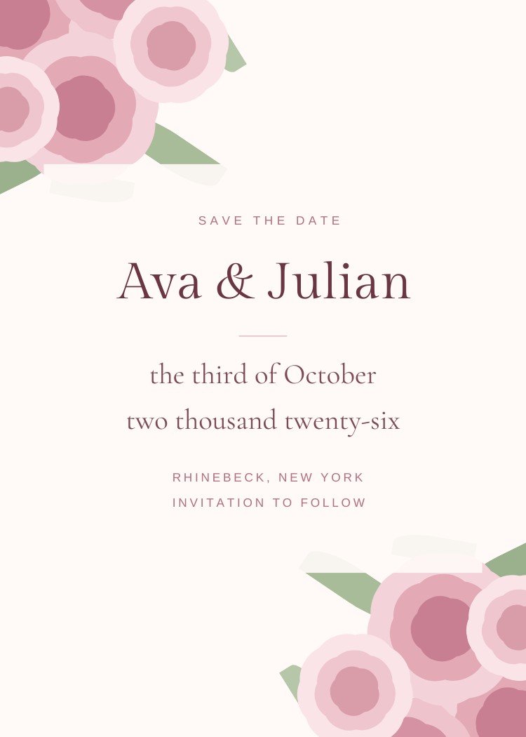
Soft pink that reads as warm neutral rather than as a colour.
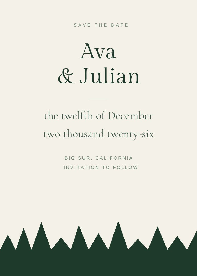
Deep forest and pine, usually with gold or cream against it.
From neon script to painted peonies — pink used deliberately.
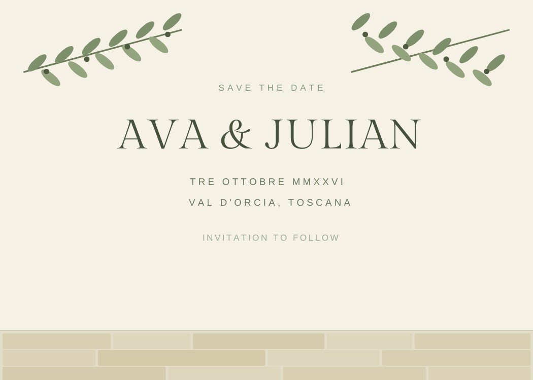
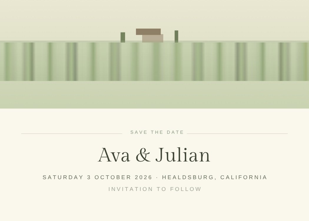
The soft grey-green that has topped wedding palettes for years.
Formal without being black, and the natural ground for gold.
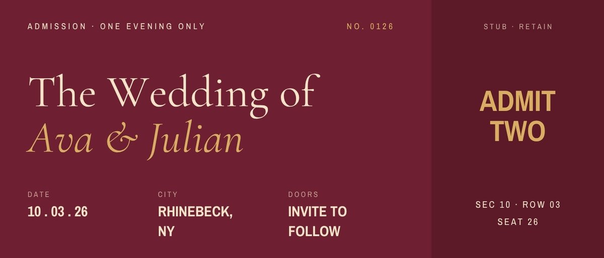
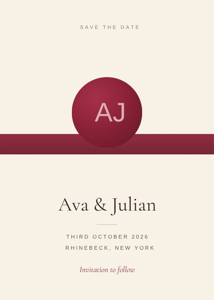
Deep wine and oxblood, mostly for autumn and winter.
Customize the design in Canva, then use Text My Wedding to text it to every guest at once and keep the list for the invitation.