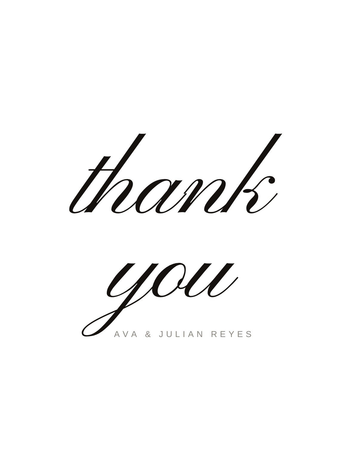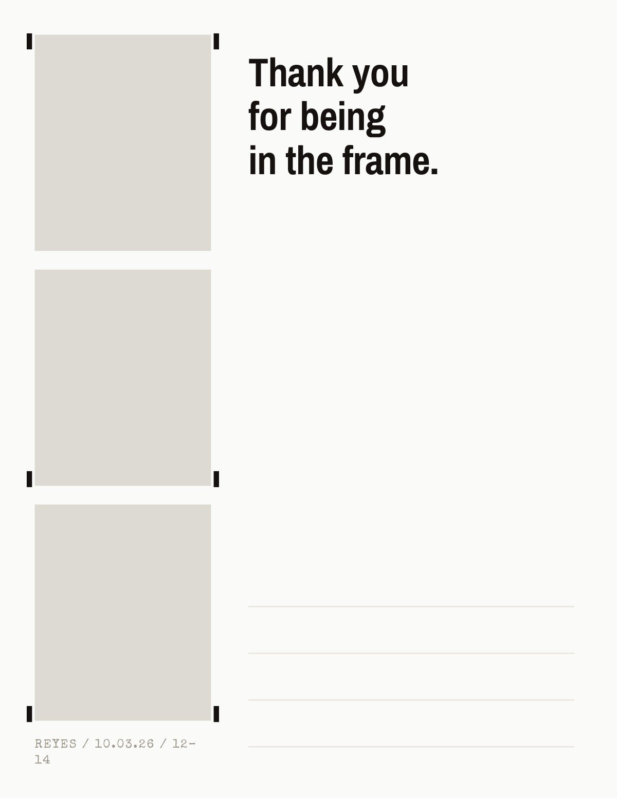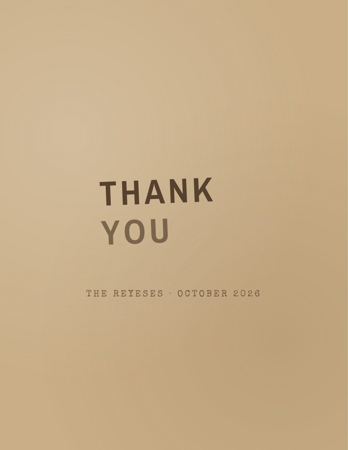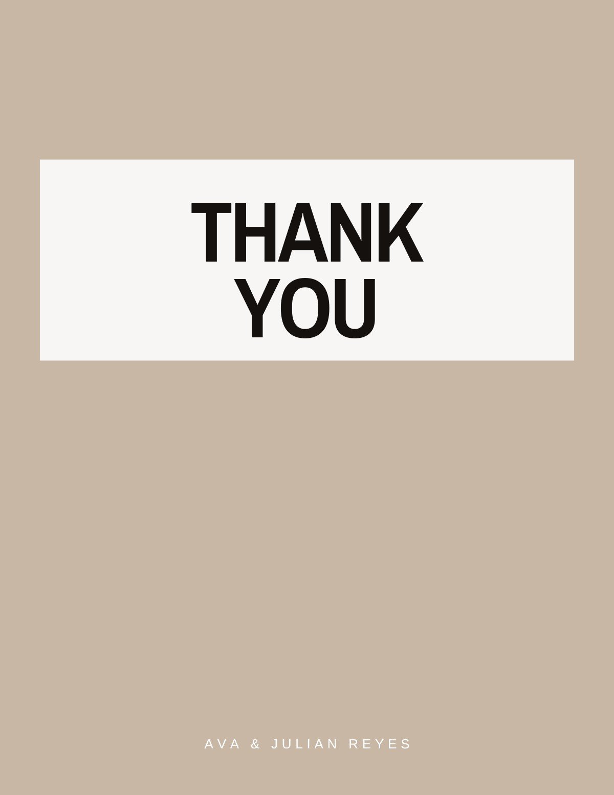
Classic
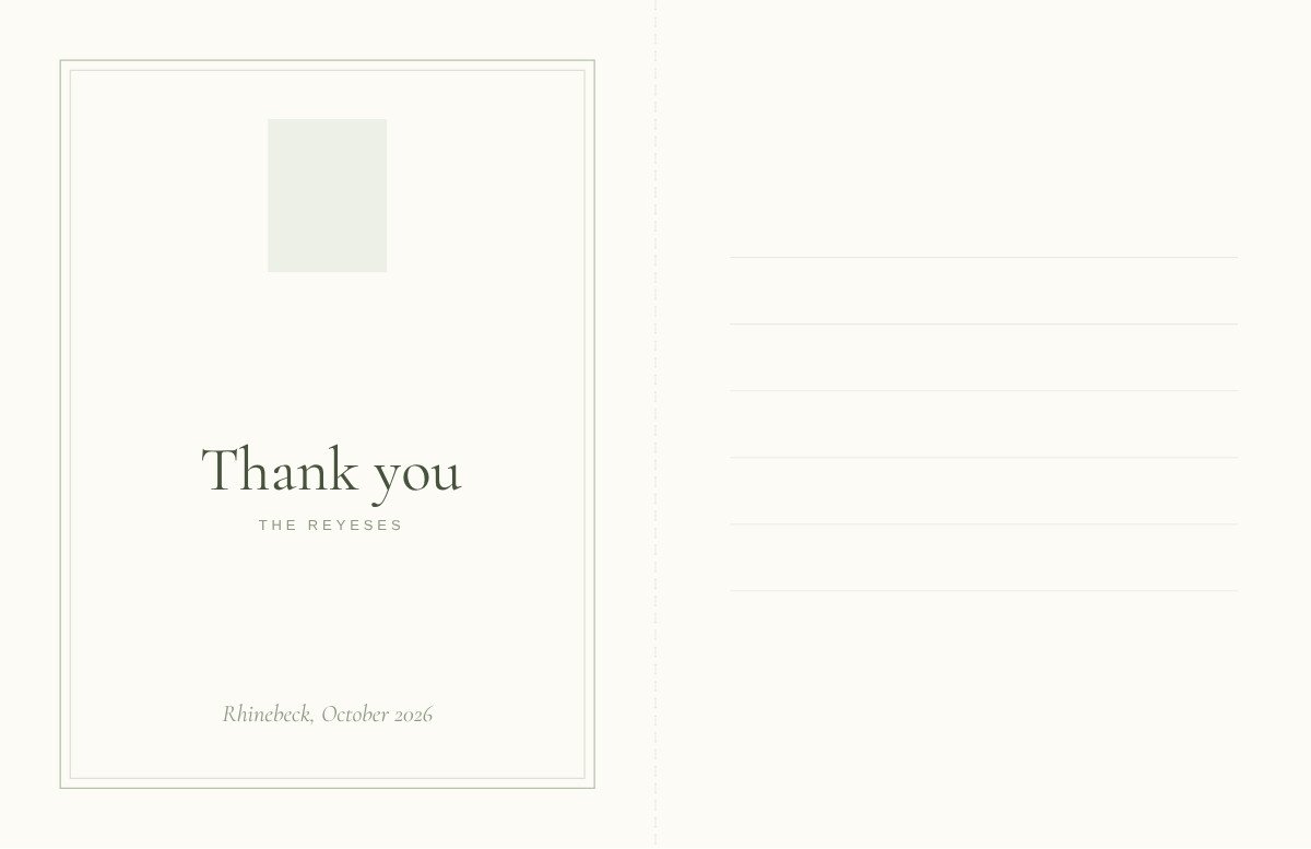
Centred serif wording, hairline rules and conventions a stationer would recognise.
6 templatesBrowse →
The visual register of the front, from blind-letterpress monograms to a rubber-stamp impression on kraft.
Centred serif wording, hairline rules and conventions a stationer would recognise.
Big type, flat colour, and a front that reads before the reader gets close.
One element, wide margins, and nothing on the front competing with your handwriting.
Cards with a joke, a wink or a scanned scrawl — warmth over formality.
Script, foil and deboss — formal without tipping into stiff.
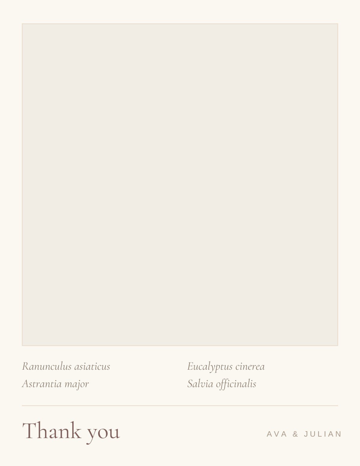
Pressed stems, evergreen boughs and drawn foliage, framing rather than filling.
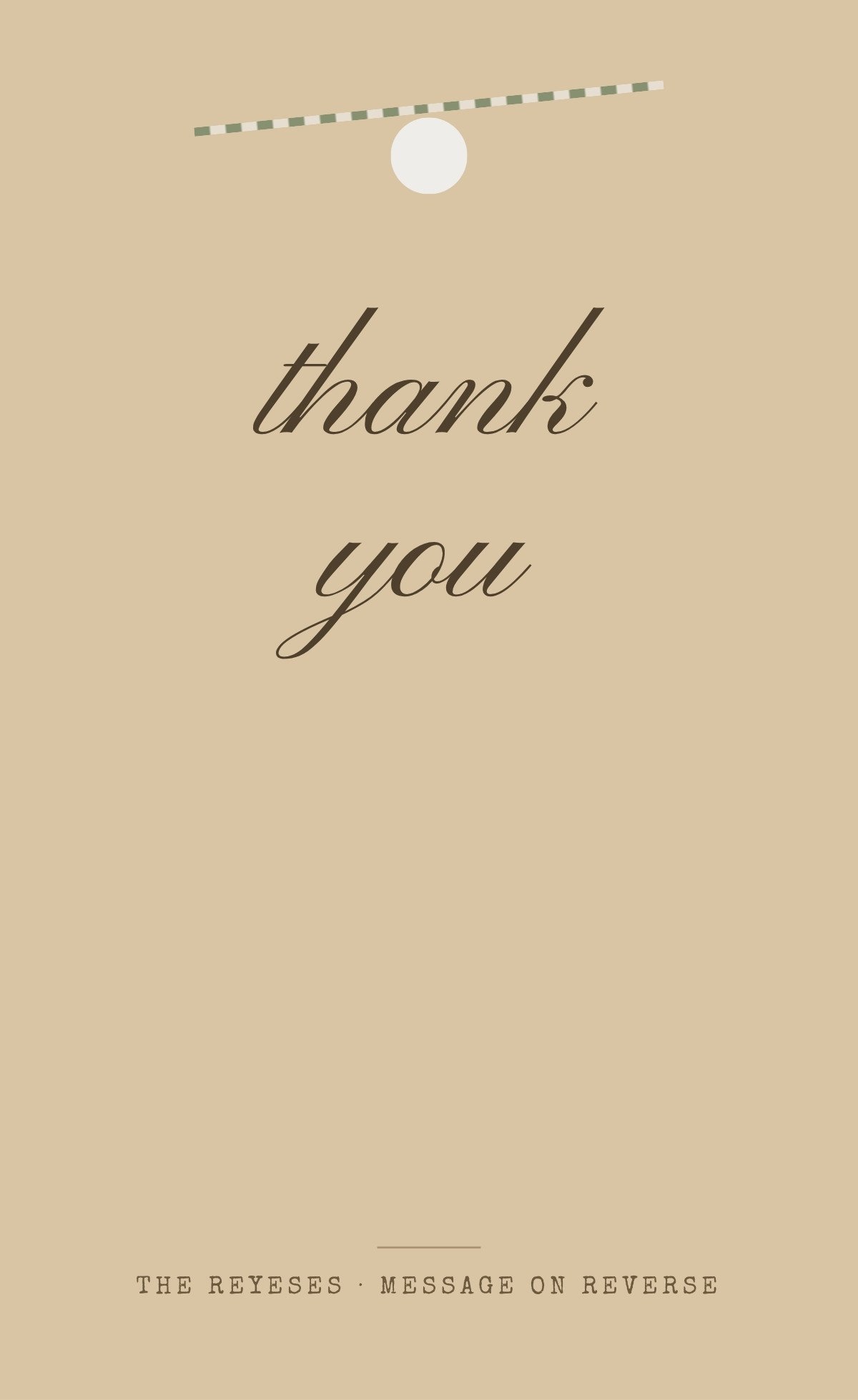
Kraft, weathered plank and twine — texture doing the work instead of ink.
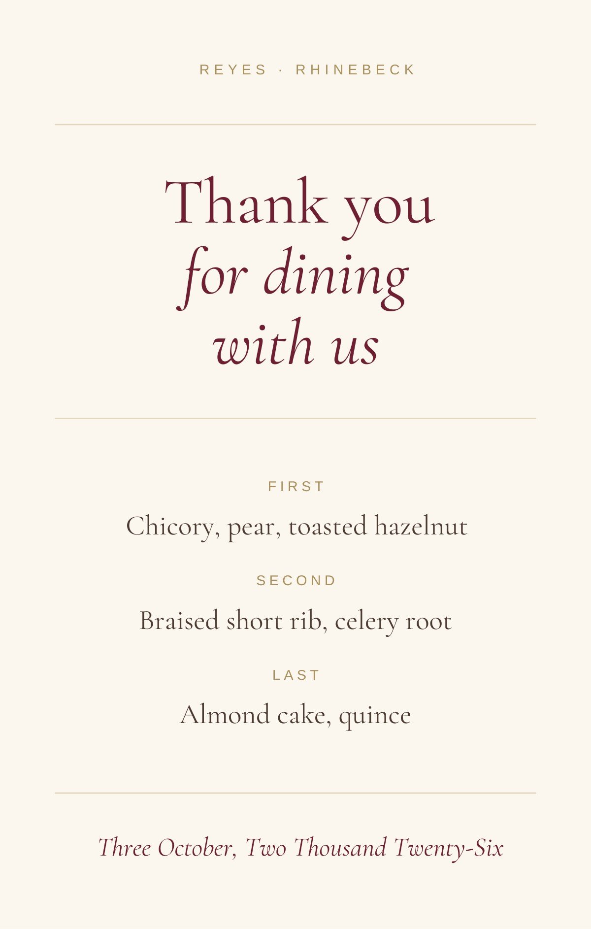
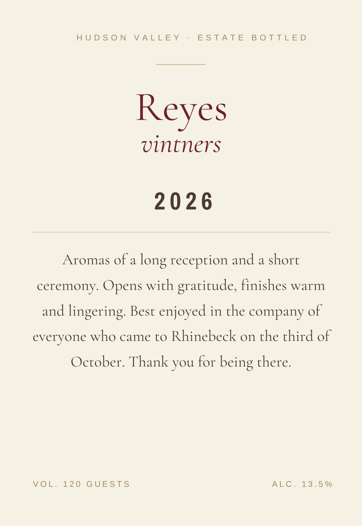
Menu reprises, wine labels and painted tile — designs borrowed from another object.
Customize the design in Canva, then use Text My Wedding to text your guests for their current address. Answers land in one list you can export for the envelopes.